
Bullseye Donuts
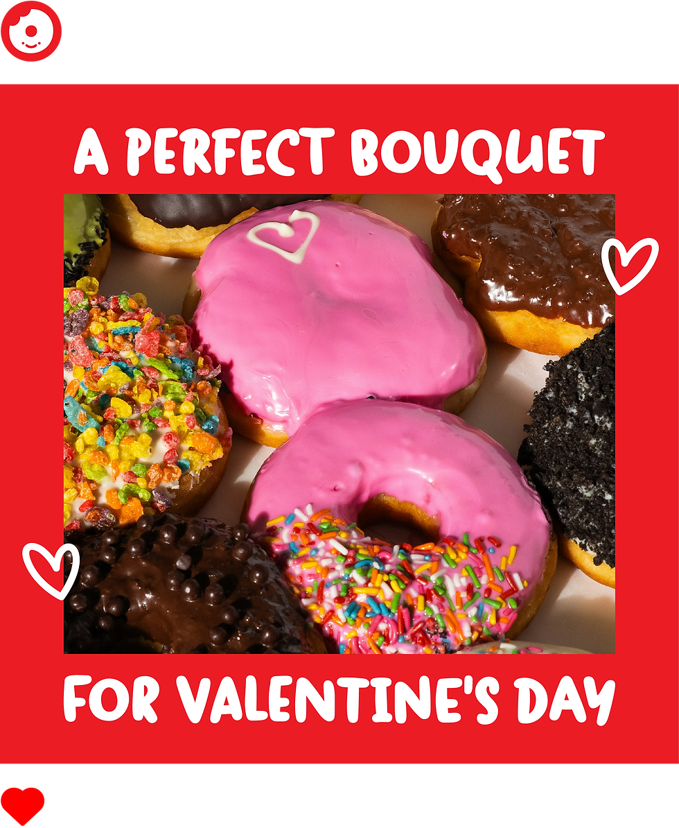
Built around a simple idea, donuts right where you want them, this brand was developed as a personal portfolio project to explore bold, graphic identity design with a playful edge. The concept leans into clarity, impact, and approachability, pairing punchy visuals with a confident tone.
The identity system focuses on high contrast, strong typography, and easily recognizable marks designed to scale across a wide range of applications. From the logo and brandmark to packaging, print, and vehicle wraps, every element was created to feel intentional, cohesive, and instantly legible, much like hitting the target every time.
Positioned as a fun, unfussy stop for a great donut, the visual language avoids overcomplication in favor of bold simplicity. The result is a flexible, modern brand system designed to stand out at a glance and feel just as satisfying as the product itself.
Brand Identity
Creative Direction
Social Media
Illustrator
Photoshop


